 Paul Nylander
 Paul Nylander
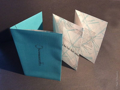
“Key” is a limited edition letterpress concertina book, designed to gradually reveal the key to life

It is paradoxical, how someone who strives for such clarity in his professional work is himself so enigmatic: how else would a Ph.D. physicist wind up as a graphic designer, practicing the book arts and printmaking, after running an engineering instrumentation company for over a decade?
Naturally drawn to contradictions, I like to consider the energy that comes from combining opposites: digital and analog, versatility and integrity, curiosity and clarity. The work on these pages reflects my personal projects in photography and printmaking, and the book arts.
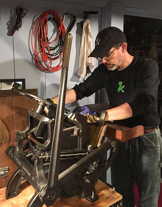
While I've talked about my early letterpress time already, it is the ongoing work that I find both calming and invigorating! This has recently been enhanced with the purchase of a small platen press, a Craftsmen variation of the C&P Pilot press. While this has only a small 6-1/2" x 10" maximum print area, it is plenty for setting cards and even small book pages.
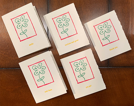
This kind of press is also great for testing out small-ish blocks (wood, linoleum, or polymer). And for playing with color. If you followed my work on the My Mighty Journey project, you know I'm a big fan of handmixing printing inks.
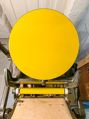
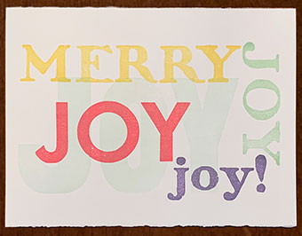
This yellow, for example. Used for the type in the cards shown above, I wanted it to be bright and cheerful, but also still legible in the 18pt Century Schoolbook I was printing it in. Mostly yellow, but a fair bit of red and a touch of blue to give it more depth.
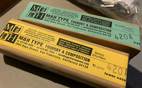
With digital fonts so ubiquitous, many designers and creators forget about where the “fonts” we use actually originated. But when working with handset metal type in letterpress, it becomes very apparent. Here is the delivery of my first purchased font of type, a set of 10pt. Century Schoolbook.
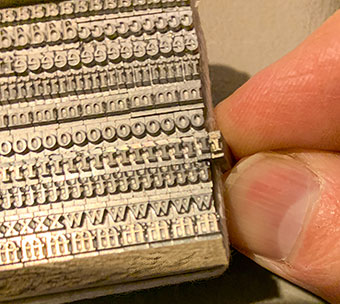
This small collection of type should be enough to get me started. Here, I was comparing this version of the Century Schoolbook produced by M&H Type on their Monotype composition caster with the type at the Minnesota Center for Book Arts collection. If you look really close, you’ll see that the baseline is slightly different; the MCBA type is probably original foundry type. Both work fine, but you can't mix the two!
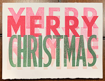
A couple of other cards I've created:
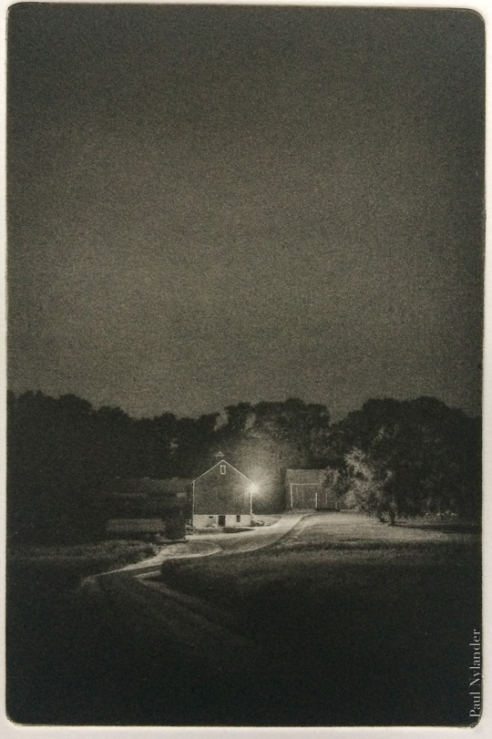
In this age of instantaneous distribution of digital images, many photographers have been faced with a fundamental question, simultaneously both pragmatic and philosophical: what exactly is a photograph these days?
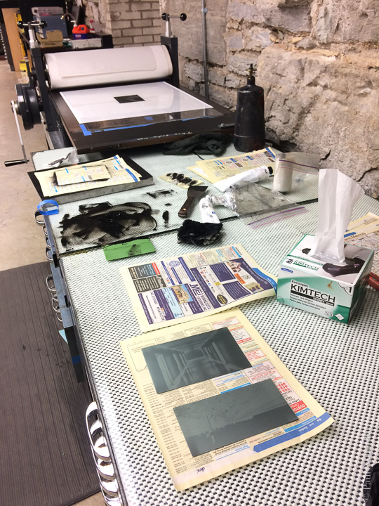
Photogravure is not a photographic process, it is a print making process. But the images generally originate photographically. In this comparison, you can see what a scanned version of one of my photogravure prints looks like paired up with a digital version.
Color choices have been made: while the digital is “greyscale” (or neutral, if you are viewing it on a color calibrated display), the print is significantly warmer.
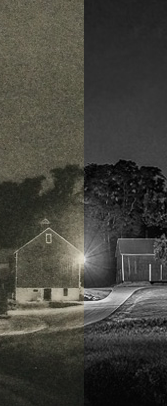
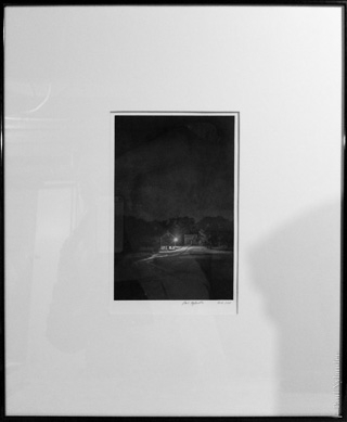
The “grain” in the gravure's sky is due, in part, to the resolution of the photo (after all, it is digital-to-analog-to-digital to see it on a website). But also due to the grainyness of the gravure plate. The digital appears to have somewhat higher resolution.
But all of these are technical considerations. The thing I find so fascinating about photogravure is the tone, or mood of the resultant images.
In part, there is a feeling of an “old photo,” that sort of non-digital softness that exists in… well… actual photographs. Ironic, isn't it?
I've printed this image as large as 24 x 36 (digital photo print) and as small as a mere 3-1/2 x 5. I can say that I will sincerely love this image in all its forms. But the small, intimate, isolated photogravure version is the one I love the most.
Many people have asked me where this picture was taken; it actually doesn't matter now, as the windmill is no longer standing. But for many years it was a favorite spot and, indeed, one of the inspirations for the “Isolation” series that would follow it.
But it stands as its own image as well, and has worked so well in both color and black & white; in winter and spring; looking south and looking west; in photograph and photogravure. All the exact same subject. Here are three different photographic depictions which really characterize the different moods the windmill can have.
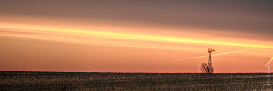
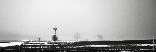
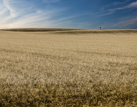
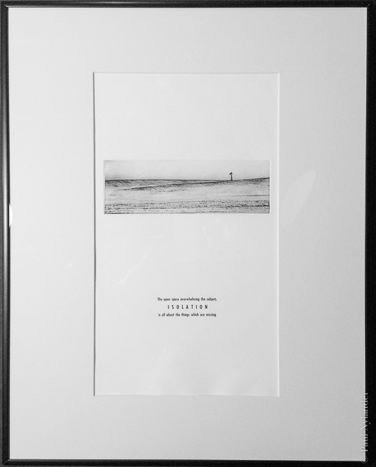
In composing the photogravure prints, I envisioned an isolated placement on the page or in the frame. This means you really have to lean forward to see the windmill, you have to surrender yourself to the scene.
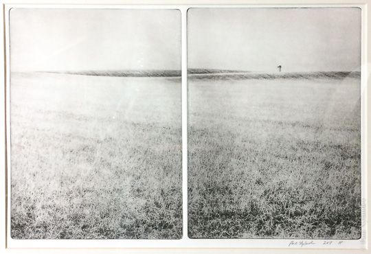
In this 16 x 20 framed example, I've added letterpress type to the page to begin to imagine the look & feel that will be in the 10 x 15 book pages.
But there is still so much room I have for emotional expression, even given a single angle and season. Here, for example, is a B&W photo, and two different photogravure plates and prints I've made based on it: one low-key with heavy blacks and relatively neutral color; the other high-key and slightly warm.
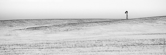
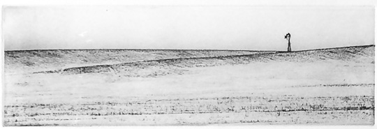
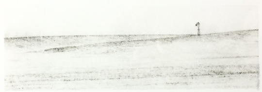
And I am sure this image will continue to evolve. The diptych at the top is the current planned image for the book (split across the book's center gutter). But we'll just have to see what actually ends up there…
Anyone familiar with the drive down California's Highway 1 from Santa Cruz to Monterey knows the halfway point on the large Monterey Bay is Moss Landing. A small fishing harbor, in the shadow of a large power plant, is a setting for great fresh seafood and many picturesque scenes. One of my favorites is the juxtaposition of the complicated fishing and pleasure boats with the peaceful water and sky.
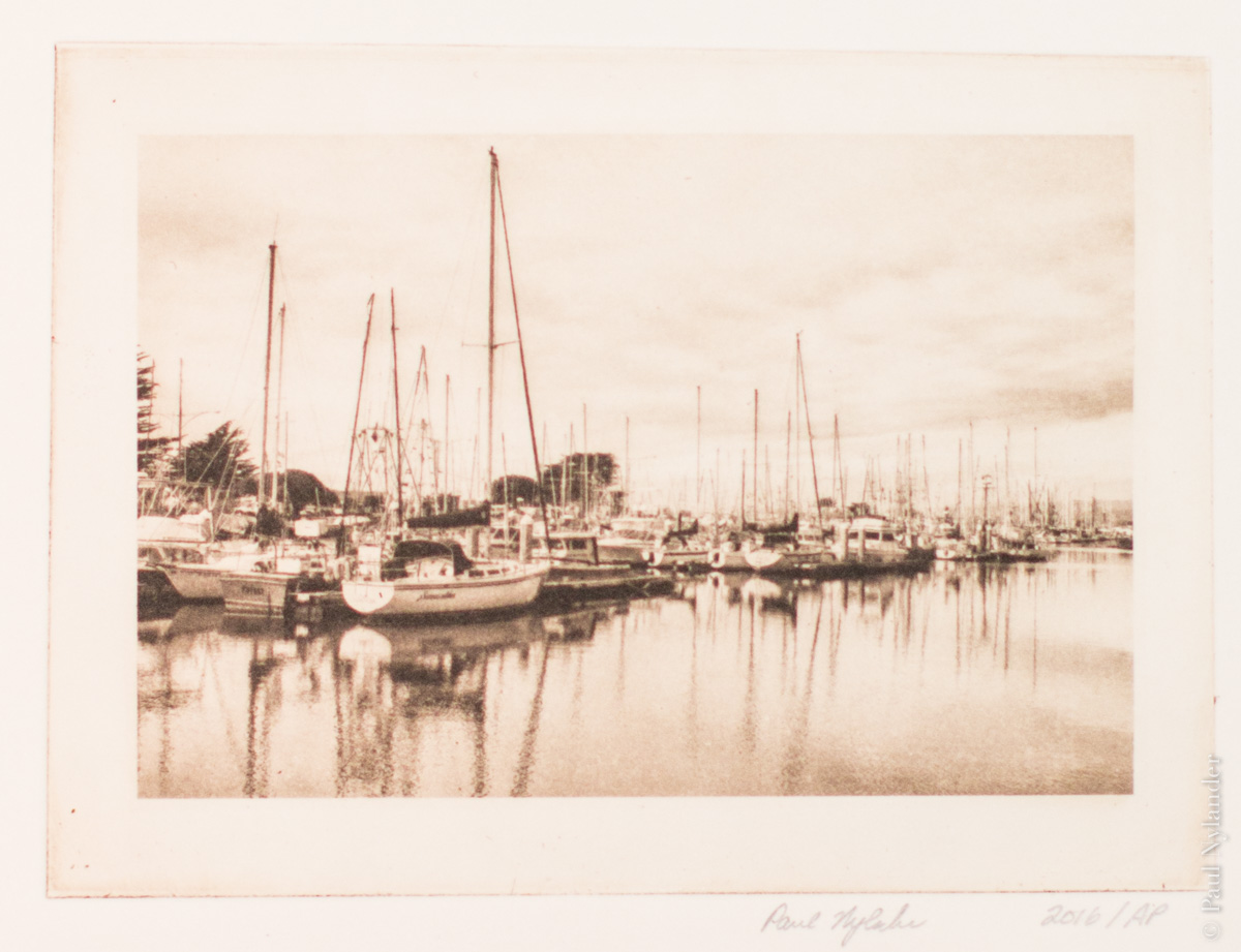
The overlap of my photographic and printmaking interests is a process known as photogravure. As old as photography itself, photogravure is an intaglio printing process which is an exercise in compromise and control. The goal is to create images which are more easily reproduced (say, for a book) than a conventional wet darkroom, but which retain more clarity and control than, say, a halftone process.
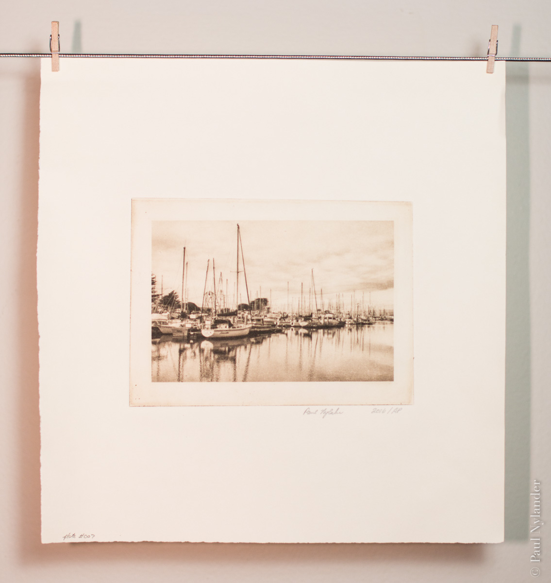
I find it recreates the feeling of older photographs, even with modern subjects such as this.
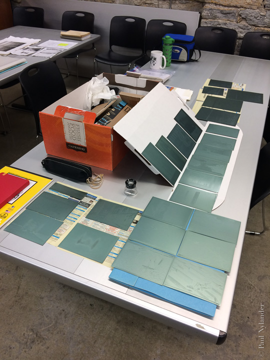
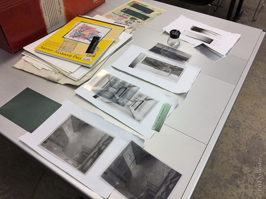
Through a series of steps, involving dozens of variables, I transform a digital photograph such as the original, below left, into a continuous tone black and white image, which is then used with a photographic process to create the plate. Yes, a photograph of a photograph, just like in the days before computers!
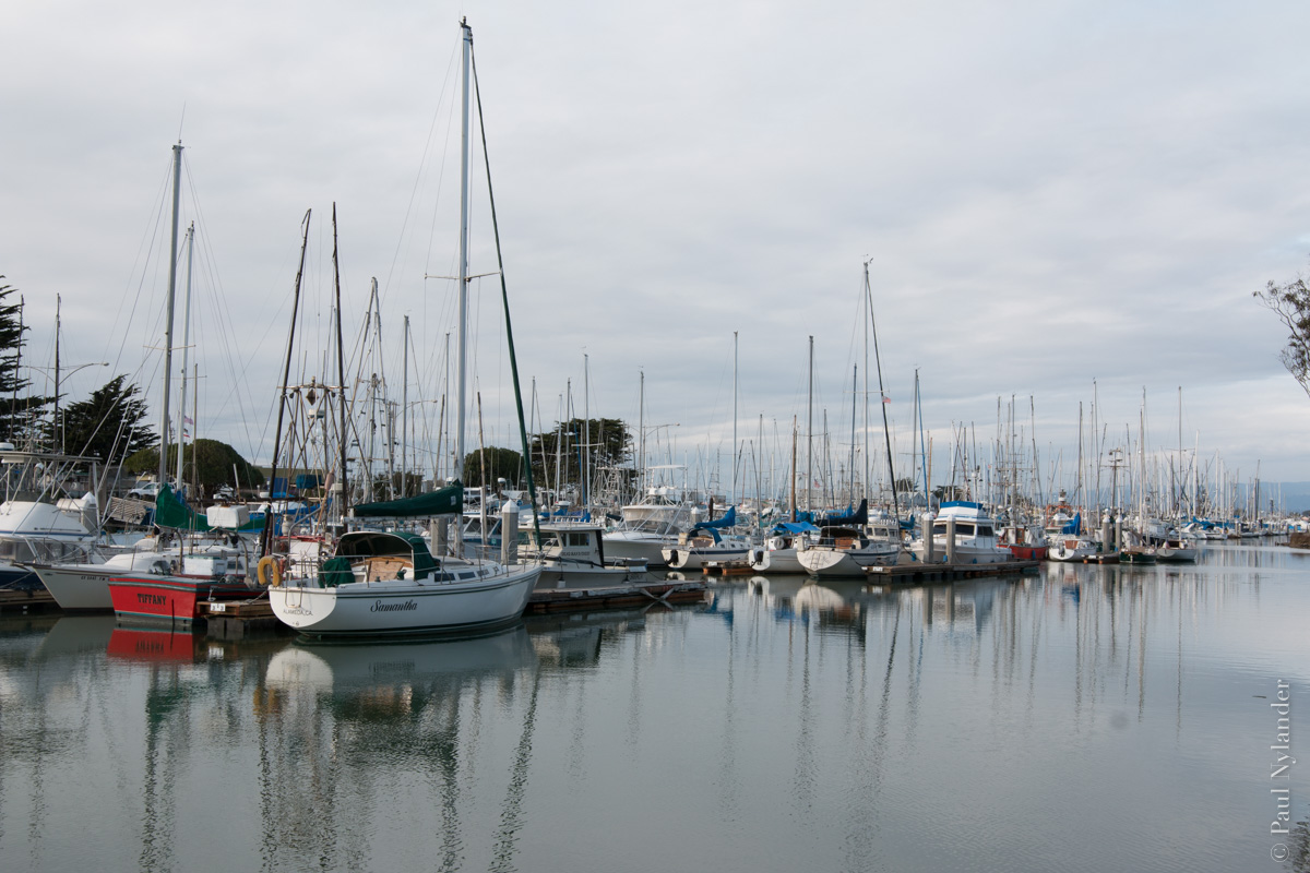
Original Photo
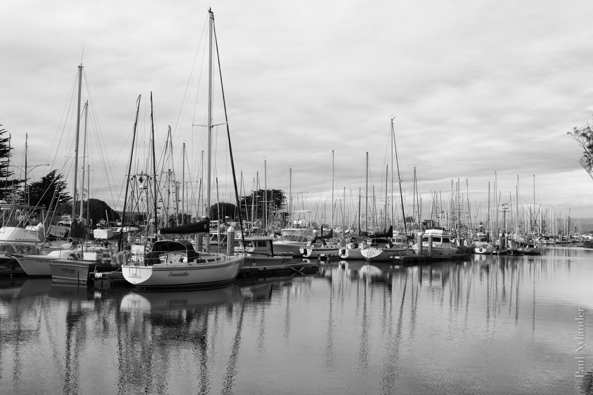
B&W conversion
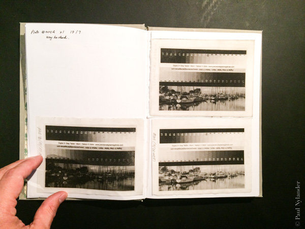
Notes on photogravure image trials
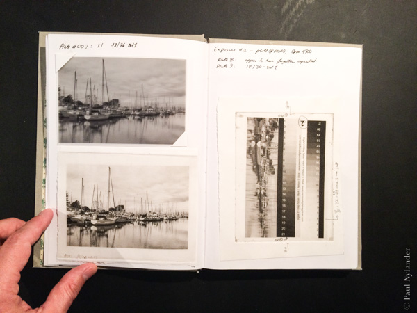
Notes and transparency used to create printing plate
For modern photogravure, a light sensitive, water soluble polymer plate is used instead of the traditional copper plate requiring an acid etch. Environmentally better, but of course not without some other compromises. But the intaglio process of hand inking, and wiping the plate, still leaves that soft residual plate tone indicative of hand printing.
I find photogravure both challenging and rewarding, and will continue to explore this medium and process further in the future. There are so many variables, so many small adjustments which can be made in processing (just like traditional wet darkroom photography) and printing (just like other intaglio printing where each plate is hand inked and wiped).
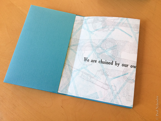
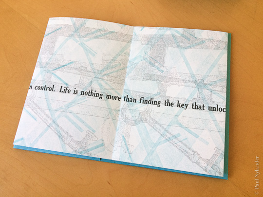
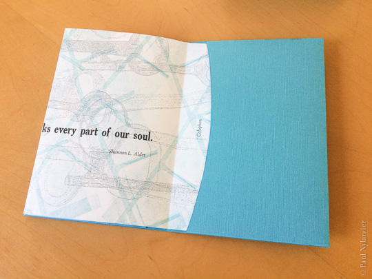
The Key book is constructed as a simple concertina, or accordion, with the first and last flaps tucked into a slipcase cover. Untucking the last flap reveals the colophon describing the book's construction.
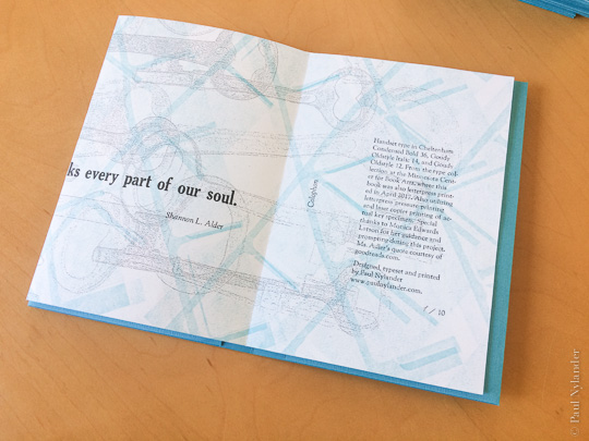
The Shannon Alder quote is a bit ironic: control is in fact the name of the game in printing. Control to maintain a uniform edition. Artist books relax this control a bit during production. Although as an artist open to the moment, control is something that is often released in the conceptualization phase. The Key book was no exception.
The image of the key on the cover is letterpress. The interior keys were digitally (toner) printers, using a photocopier to enlarge actual keys. Overlays were created by running the sheets through several times. Then the blue was mixed to match the cover paper color, printed using pressure printing and a work-and-turn approach, flipping the pressure printing stencil over between passes.
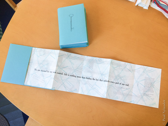
Owing to the length of the book, the printing was actually done in two sections, the left set of panels and then the right. The text was the final printing layer. So, in total, 12 printing passes were done, plus one for the cover, before the book was ready for trimming and assembly.
Created in an edition of 10.

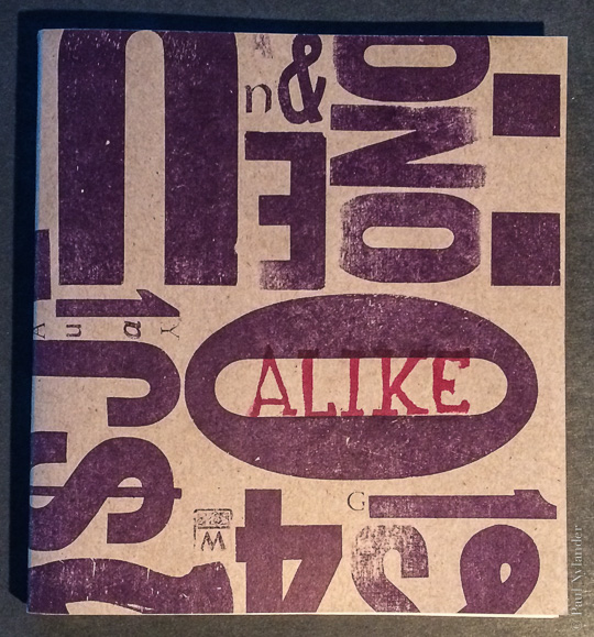
As an avid collector of many things, I created this book as a way to explore what it means to be a part of a “collection;” in particular, how similar or dissimilar things must be to be considered part of a group.
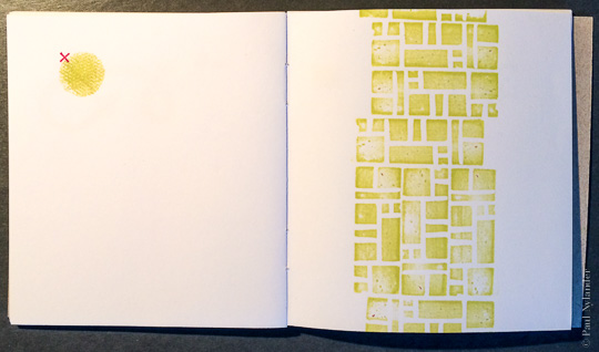
In this page, the circle is “x’ed” because it isn't the same as the squares. But then again, it is the same color, so perhaps it should be considered the same?
Or consider,
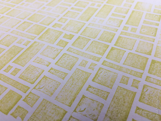
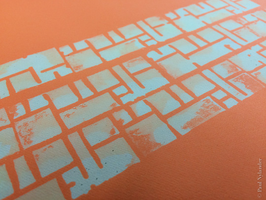
These two pages utilize exactly the same pattern; but in one case it is green ink on white paper, while in the other it is white on orange. Are they Alike? Or not?
This is a one-of-a-kind handmade book, codex sewn binding. Printing is done with both handcarved and stamps found in the MCBA collection. In addition to stamping ink, the white on orange mentioned above is bleach stamped onto colored paper. The cover is remnant letterpress cardstock with ink stamped handcarved lettering block.
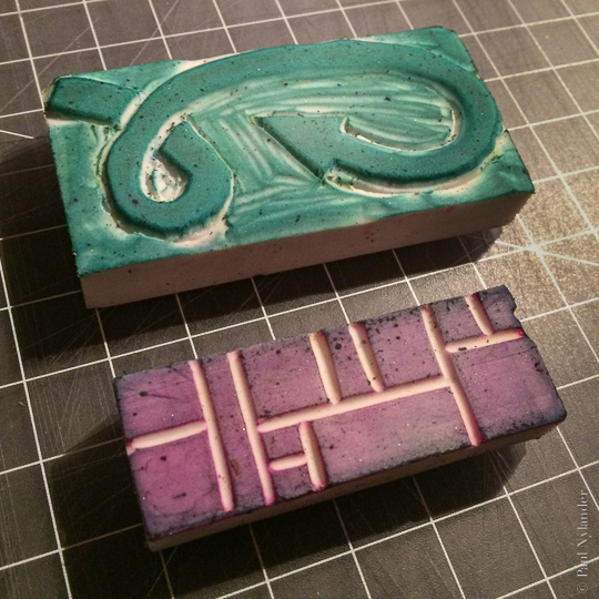
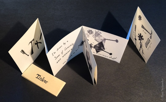
“I'm driven by a sense of curiosity and wonder.” And so the story opens. A personal statement about how my interest in how things—everything—works, and why I “tinker.” This one-of-a-kind book is a mere 3 x 3 inches with a belly band. Constructed in a meander binding style, it is printed entirely of handcarved stamps, stencils and hand lettered text.
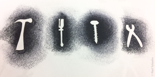
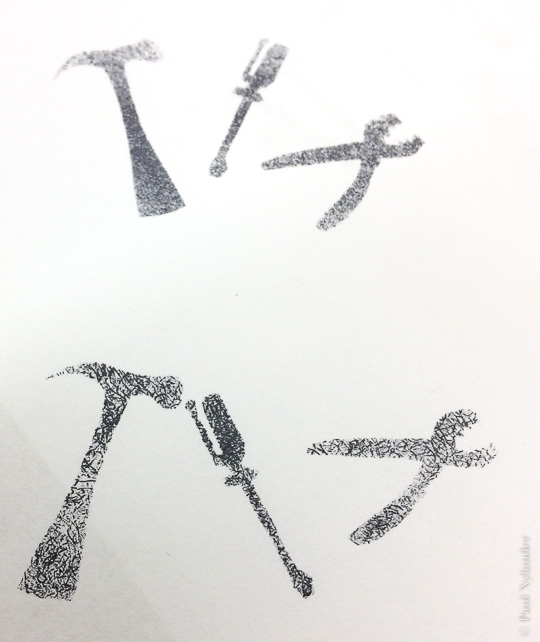
The stencils are simple enough line drawings cut into thick paper. But it is how they are integrated into the images where things get exciting. Using a stamp pad and a variety of materials, such as cheese cloth, rubber anti-slip, sponges, and even other stamps, a variety of fun textures can be created.
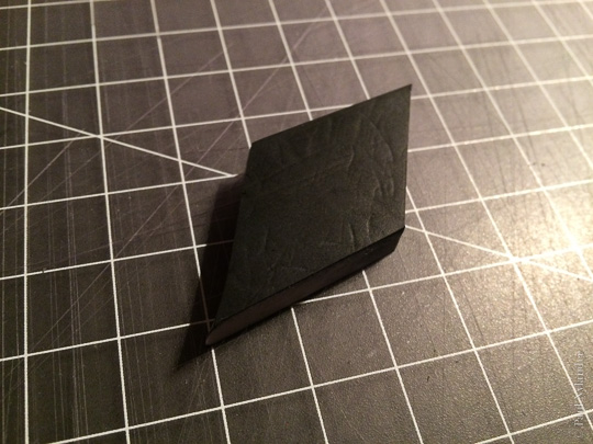
A simple parallelogram is used multiple times to create a box of leftover odds-and-ends—just like you'd find in my workshop.
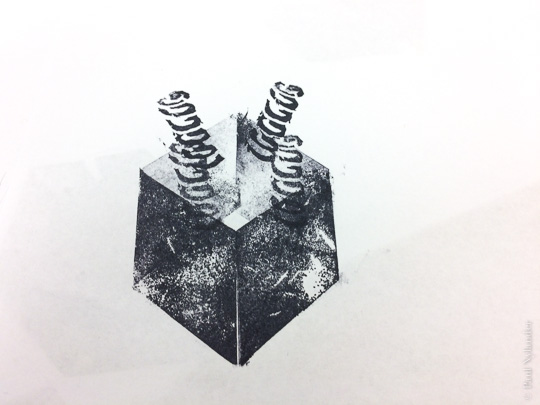
Springs and gears round out the exploding world of possibility
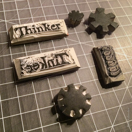
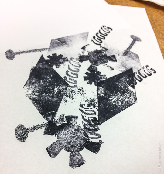
I consider myself lucky to be able to assist with this special project. Utilizing the text of author John Coy, I am assisting world-renown illustrator and print maker Gaylord Schanilec in creating the sixteen letterpress relief prints which will illustrated this children's book, written in the first-person perspective of St. Anthony Falls.
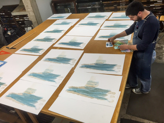
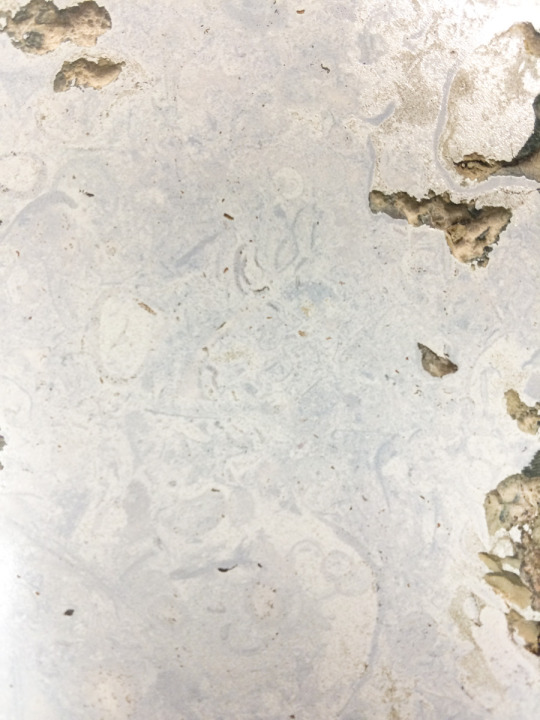
Color blending, considering the properties of wood and stone under pressure, and the power of Bondo are all in a days work on the My Mighty Journey project
The falls started out in downtown St. Paul over 10,000 years ago, making its journey upstream 12 miles to its current location in Minneapolis, all the while carving out what would become the bluffs of the Mississippi in what would become the most scenic part of the Mississippi National River & Recreation Area. Indeed a mighty journey!
Similarly, a mighty journey for those of us involved with the project, which started in June 2015, will continue until at least 2018. Printing from materials found along the banks of the Mississippi, we've explored rotten wood and bark, limestone and brick, fresh plant leaves and rubbings of ancient spear points.
I encourage you to learn more and follow the project's progress on the My Mighty Journey Blog, which I maintain to document the exciting “discoveries” we make along the way!
Letterpress is where print making started for me. A love of old machinery. The calm that comes from unplugging and working directly with ink and printing blocks. An element of serendipity exists in the analog art world which just harder to find while working on a computer. The tactile nature of the medium, the papers. The sound of the press.
It is a different world.
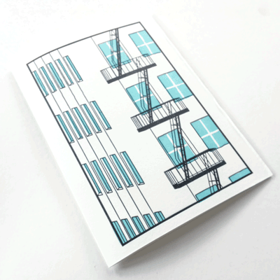
As many of my images, the idea for this greeting card started as a photograph. Printed in two colors, it embodies the simplicity that can exist when you are working with ink and paper.
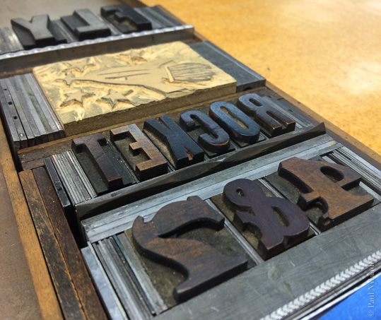
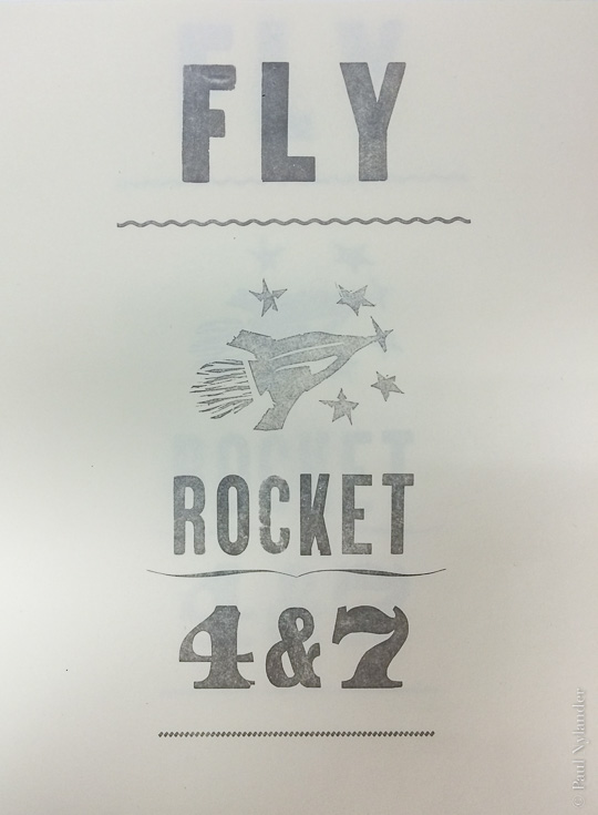
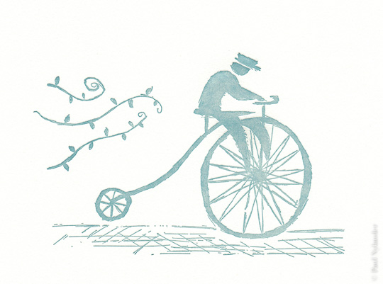
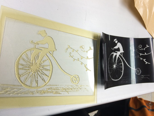
Whether it is wood type and lino cuts, polymer plates, or handset metal type, letterpress always makes a relief print: the parts that are up at the right height are inked and printed, those that are lower are not. And always in reverse.
As a member of the artist cooperative at the Minnesota Center for Book Arts, I'm lucky to have access to a variety of letterpress equipment, a good collection of metal type, and a great community to support whatever I might want to make.
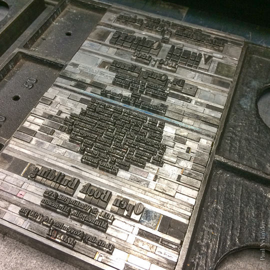
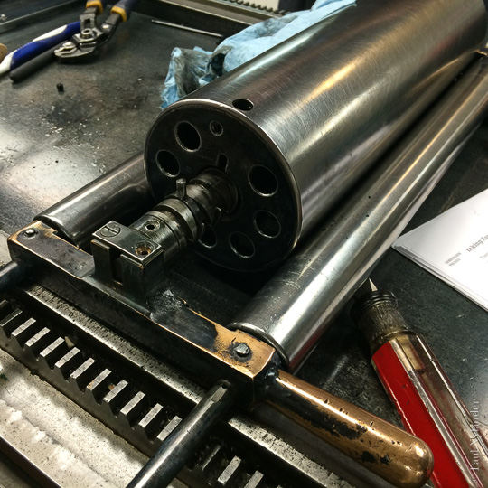
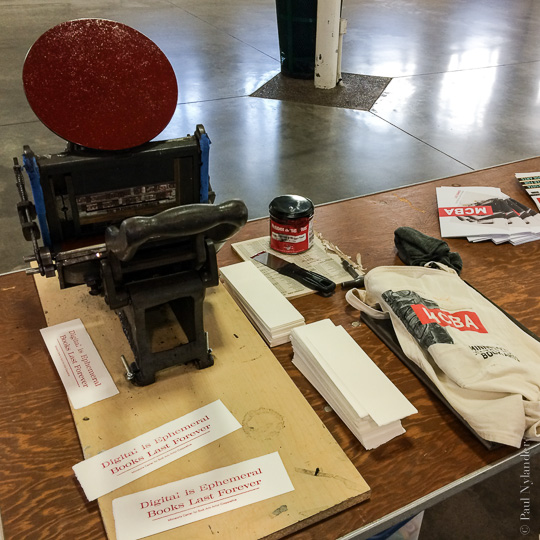
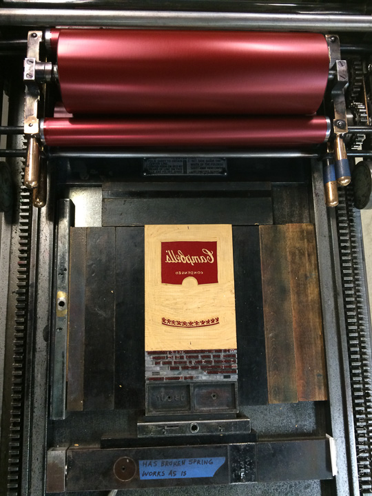
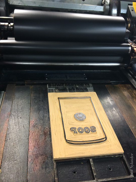
Whether it is something serious or silly, I've found letterpress to be a great way to print. Expressive, contemplative printing and a wonderful finished product.
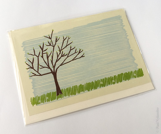
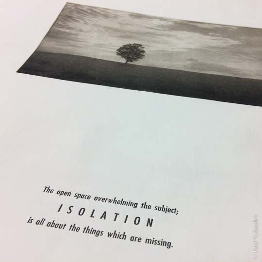
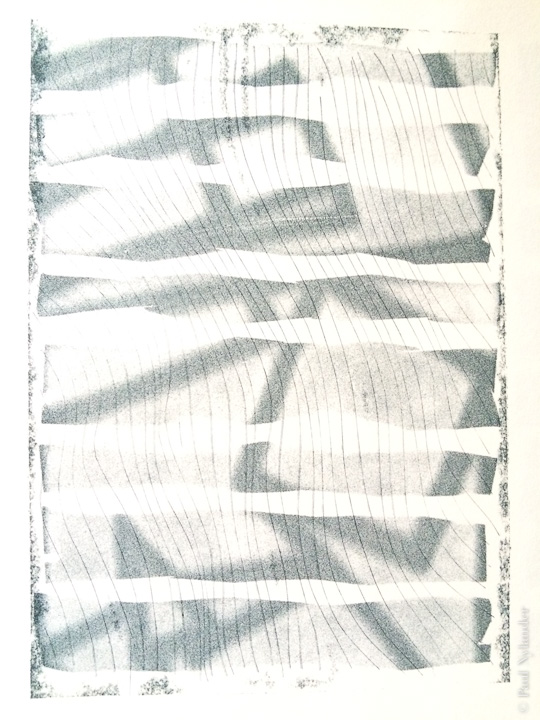
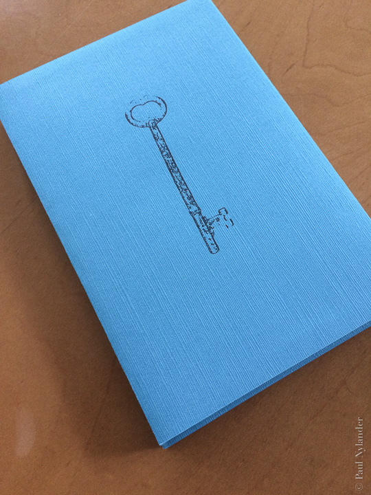
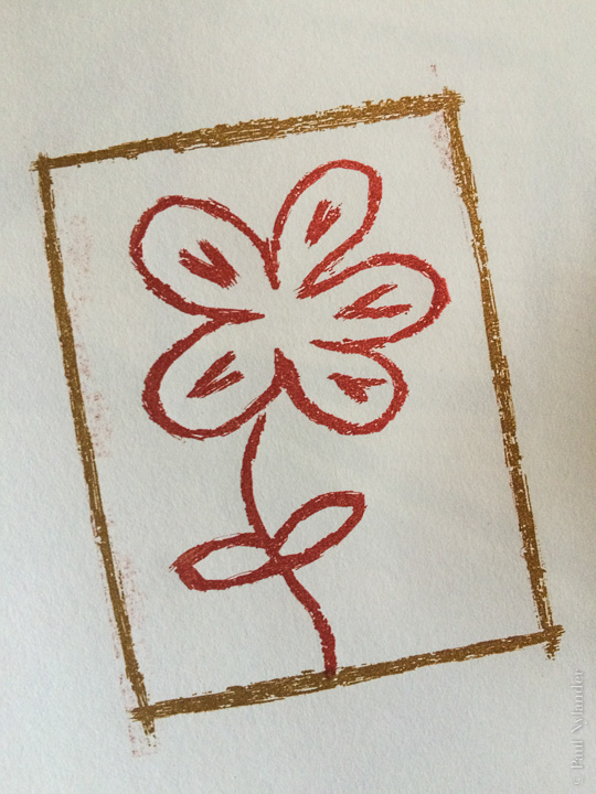
The letterpress discussion continues with recent little projects.
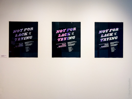
As much as I like the look and feel of letterpress, it is through screen printing that I can really approach poster sizes. Like letterpress, screen printing is one color at a time; meaning that spot colors are the norm, registration of multiple colors becomes a problem, and photo-realism isn't the goal.
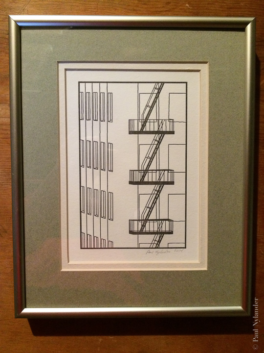
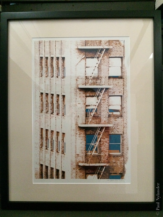
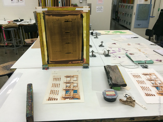 The “Fire Escape” image is another example of a design which is used in both letterpress and screen printing. Each has its own character, its own mood. But both work. (Left is a single color letterpress line art rendition, while the editioned four color screen print is on the right.)
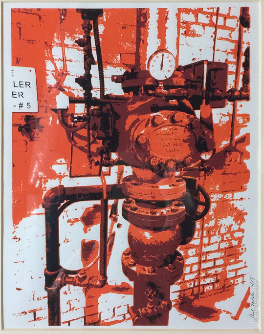
The “Pipes 1” print is another example of multi-color screen printing.
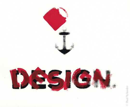
And a couple of other earlier examples of screen printing work.
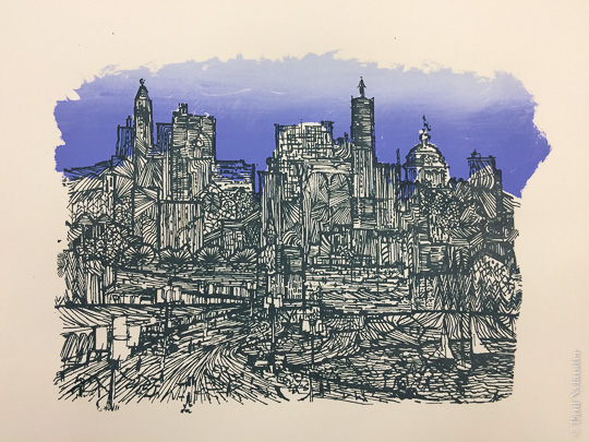
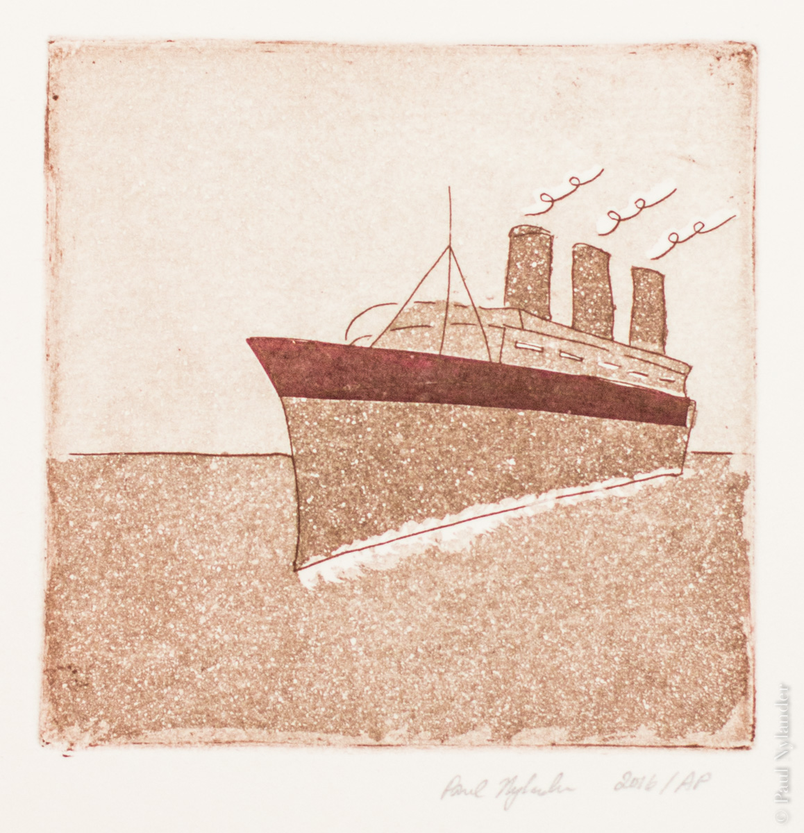
Printmaking, in all of its various forms, intrigues me for both the historical significance, and also the control as an artist that I have while creating images. Intaglio, where paper is pressed into a plate to pull ink out of etched indentations, is particularly an exercise in control: each print involves hand inking and wiping the plate. Each impression is therefore unique.
The added element of chine collé, in this image the red stripe on the hull of the ship, enhances the unique characteristics of each single-color image I create. Using a carefully cut and placed piece of red paper which is bonded into the underlying sheet during the intaglio press pass, I can add colorful accents without needing an additional printing plate.
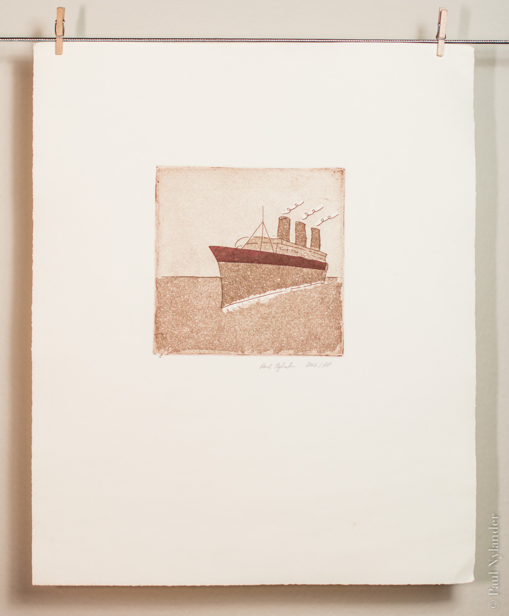
This is an original sketch I created specifically to explore the the possibilities of different aquatint tonalities, for the sky, water, ships hull and smoke stacks. Each tone involves masking and etching each section separately.
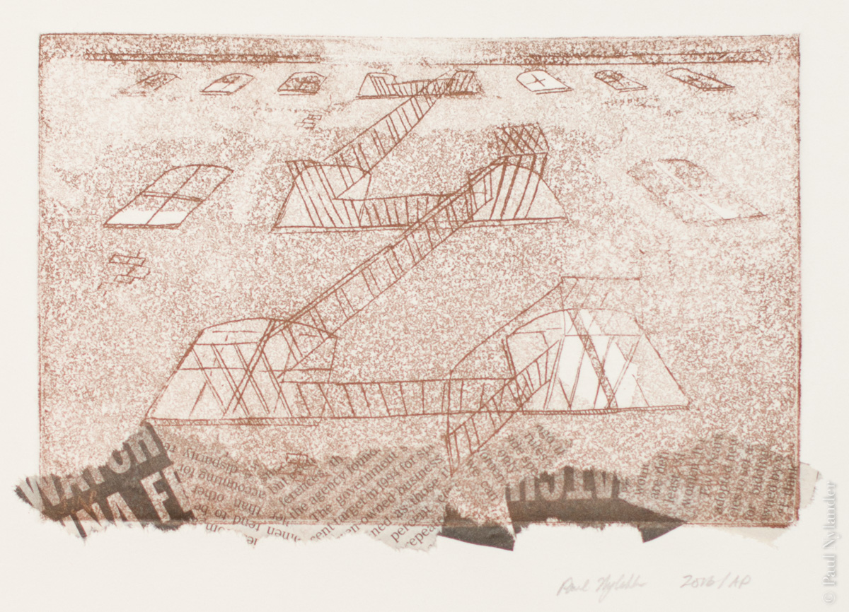
The characteristic of the back alleys of the city have always intrigued me: the wirey fire escape clings to the rusting brackets attached to the less cared for side of buildings.
In this single-color intaglio image, I captured the feeling of standing looking up in a narrow alley, using chine collé newsprint to make the feeling of rubbish blowing around.
Additional texture to the building is provided by a resin aquatint, applied in stages during the etching process.
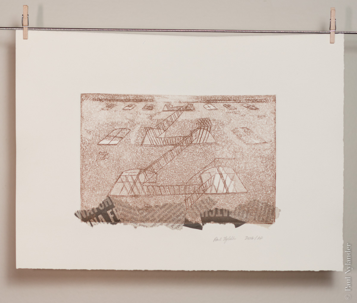
This image is based loosely on a photograph I took, most likely in Chicago. But the newsprint is from a copy of the New York Times I found lying around the print shop in Minneapolis, so… it is multi-regional.
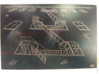
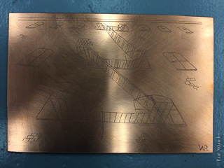
Here is a look at the early plate, with the hardground before and after the first etching. The plate texture will be performed by subsequent etchings.
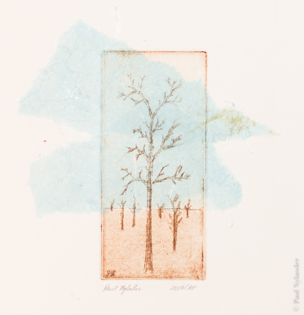
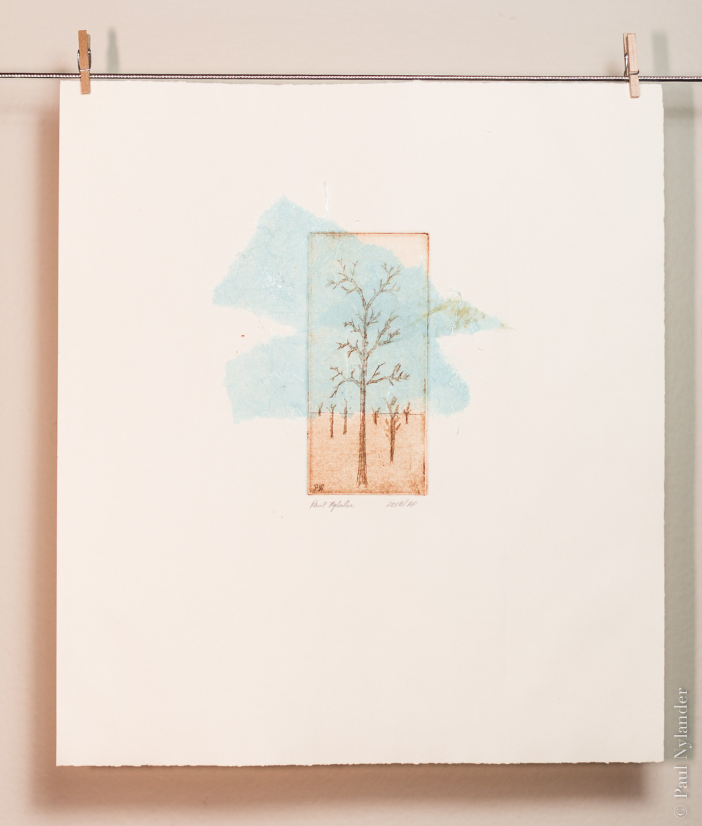
Revisiting the theme of isolation, this original sketch was created through brushwork with the “ground,” or acid masking material, to create a softer appearance to the tree trunks and branches. A fine-line etch was used as the basis, and the horizon.
The abstract sky, created with a thin blue tissue paper and chine collé, breaks out of the boundary of the plate. I wanted this watercolor sort of effect, created entirely with torn paper, to further enhance the isolation of the tree.
I'm also using the more extreme aspect ratio that I've come to enjoy in my photography.
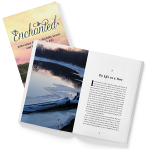
In addition to my work as a visual artist I enjoy working as a freelance graphic designer, with a focus on book design (both covers and interior system design & typesetting) and other informational systems, such as presentations (think PowerPoint), signage & wayfinding, and information graphics. This work is described in more detail over at www.illustrada.com. But here is a sneak peek…
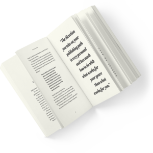
Typesetting is an exercise in nit-picking; taken individually, most typographic decisions are rarely seen except by those who have a trained eye. But taken en mass, the interior (or layout) design and the fine-tuned placement of text can aid the author (if done well). Or frustrate the reader, if not done well. I love this kind of detailed work.
Interior design is a balancing act: engage the reader, help propel them through the document, and then get out of the way. Except when talking to another designer, generally it is a fail if the reader “notices” the design. But that means understanding the reader's expectations… the cornerstone of all good design.
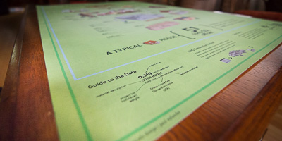
Developed for Better Futures Minnesota through the Ecotone group, this poster aims to help people visually understand the carbon cost savings associated with reusing components of demolished house, versus landfilling everything.
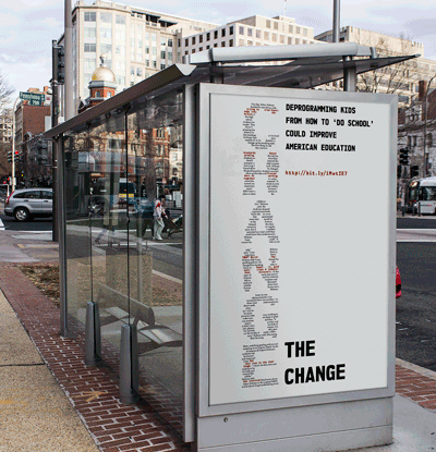
This poster promoting an educational system update campaign called “Change the Change” is purely typographic, and designed to work at multiple distances—with the large “change” transforming to the teaser text as one gets closer.
“Combining artist Paul Nylander’s haunting images with a personal narrative, Isolation is as much a proclamation of society’s need to accept the need for artistic isolation, and an artist’s need to break that detachment, as it is a book of images. By marrying photogravure images depicting various types of isolation with a short series of thoughts and questions, this contemplative work surrounds the reader with abundant white space, allowing the images to sit in isolation, yet always in mind as an echo of the past or hint of the future.”
_600-%C2%A9paul_nylander.jpg)
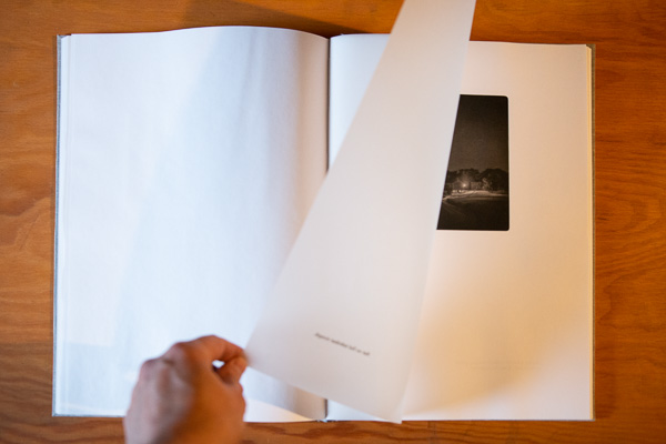
This photography collection, exhibition, video, and now fine press book represents both the beginning of my artistic explorations, and the ongoing exploration into the necessity, and contradiction, of self-imposed isolation to the “creative” professional.
Evolving from digital photos to photogravures, the original exhibition photographs were taken from 2010 – 2012, from a variety of locations in the U.S. and Europe. However, the locations are less important than the subject, and its relation to its own isolation.
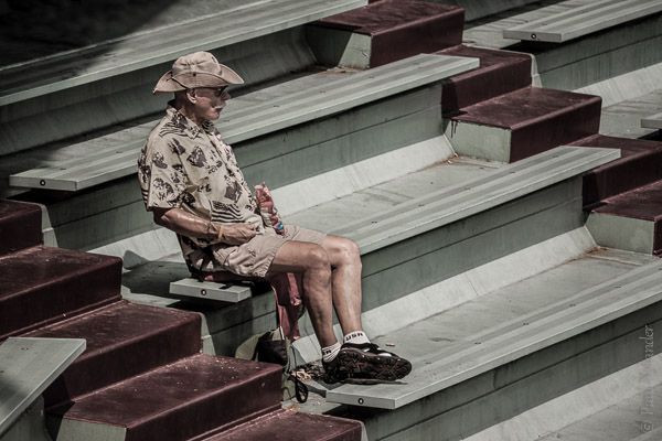
This theme has been a recurring one for me in both my personal search for “life's meaning,” and as a theme in my visual art. Watch for it in the intaglio and photogravure printmaking as well.
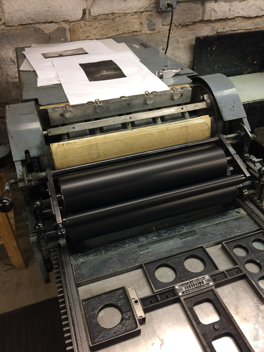
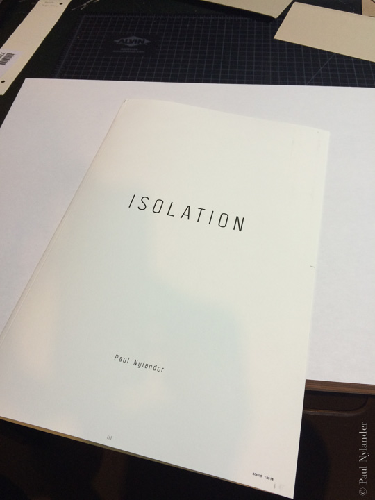
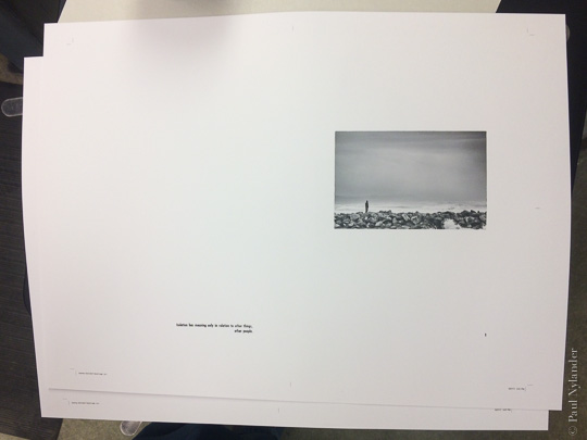
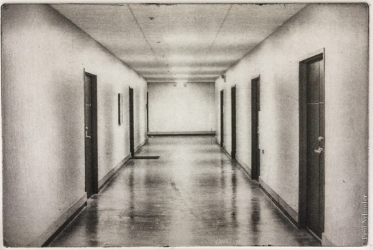
While other parts of this website talk about the nature of the photogravure imagery, I encourage interested readers to also take a look at my design website www.illustrada.com for more information on the design and construction of Isolation.
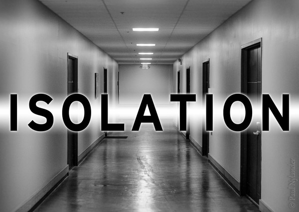
Here is the original Isolation photography and video exhibit gallery